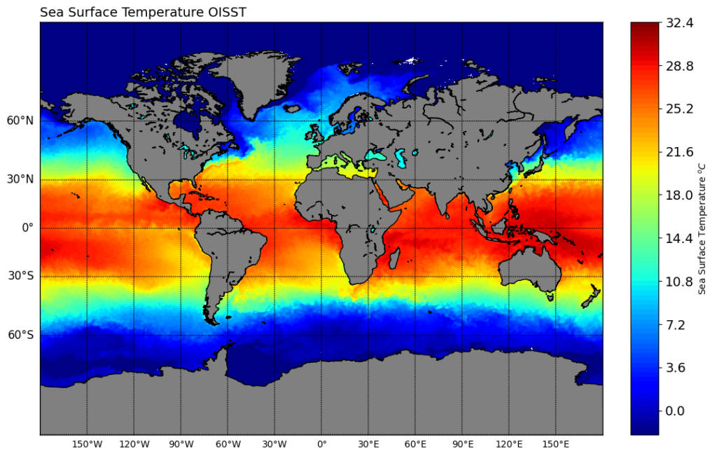
Sea surface temperature (SST) is a critical parameter in understanding oceanic conditions and climate patterns. By visualizing SST data, we can gain valuable insights into temperature variations, ocean currents, and weather phenomena. In this blog post, we will walk through a simple tutorial on using Python, Basemap, and NetCDF4 to visualize SST data. By the end of this tutorial, you’ll have the skills to create compelling maps of SST, unlocking a deeper understanding of our oceans’ thermal dynamics.
Understanding NetCDF4
NetCDF4 is a file format widely used for storing scientific data, including SST data. It provides a convenient way to store and access multidimensional data arrays. We will begin by understanding the basics of the NetCDF4 format, exploring its structure and how to access the SST data within.
Loading SST Data with Python and NetCDF4
Python’s NetCDF4 library allows us to easily load and manipulate NetCDF4 files. We will demonstrate how to import the necessary libraries and load SST data from a NetCDF4 file into our Python environment. This step sets the foundation for our subsequent data visualization tasks.
Creating Basemap for SST Visualization
Basemap is a powerful Python library for creating maps and visualizations. We will dive into the fundamentals of Basemap and learn how to create a map projection that suits our SST data. By configuring the map’s extent, projection, and other parameters, we can customize the visual representation of the SST data.
Visualizing SST Data on the Basemap
With the SST data loaded and the Basemap created, we will merge the two to generate a comprehensive visualization. We will demonstrate how to plot the SST data as a color-filled contour plot or a shaded image overlay on the Basemap. By adjusting the colormap and colorbar, we can effectively communicate the temperature variations across the ocean surface.
