Field surveys provide invaluable insights into the complex dynamics of ecosystems, and one key parameter often measured is chlorophyll levels. Chlorophyll serves as an indicator of primary productivity and can help us understand the health and functioning of aquatic environments. In this blog post, we will harness the power of Python to analyze and visualize field survey data on chlorophyll using scatter plots. By uncovering relationships and patterns in chlorophyll levels, we can gain a deeper understanding of ecosystem dynamics and contribute to environmental conservation efforts.
Understanding Chlorophyll Scatter Plots
Scatter plots serve as a powerful visualization tool to explore the relationship between chlorophyll levels and other environmental variables. They allow us to observe patterns, trends, and potential correlations between chlorophyll concentrations and factors such as water temperature, nutrient levels, or light availability. Through Python, we can create visually engaging scatter plots that shed light on these relationships.
Importing and Preprocessing the Data
To begin our analysis, we need to import the field survey data on chlorophyll, which is typically stored in a CSV file. Using Python’s Pandas library, we can efficiently load and preprocess the data, handling missing values, converting data types if necessary, and ensuring the data is ready for analysis.
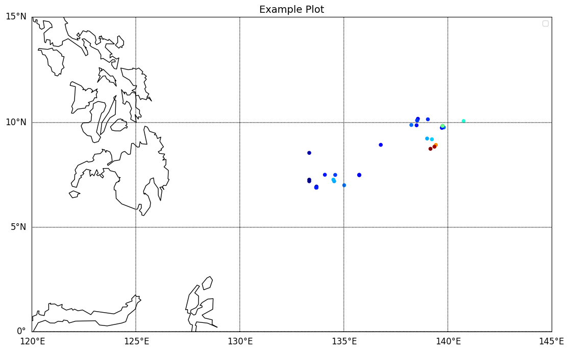
Plotting Chlorophyll Scatter Plots with Python
Using Basemap, we can plot the chlorophyll distribution data on a map. We will demonstrate how to define the map projection, customize the map’s appearance, and overlay the chlorophyll data as markers or color-coded regions. This allows us to visualize the varying concentrations of chlorophyll across different geographic locations, providing a comprehensive view of the ecosystem’s health.
You can download the example data here.
import pandas as pd
import numpy as np
import matplotlib.pyplot as plt
from mpl_toolkits.basemap import Basemap

cordb = pd.read_csv(r'C:/Users/Deuterium/Downloads/Hasil/Example.csv')
level1 = cordb['CHL'].values
lat = cordb['Latitude'].values
lon = cordb['Longitude'].values

fig = plt.figure(figsize=(20, 8))
m = Basemap(projection='mill',lat_ts=10, resolution='l',
            llcrnrlat=0, urcrnrlat=15,
            llcrnrlon=120, urcrnrlon=145, )
m.drawcoastlines(color='black')
parallels = np.arange(-20,20,5)
m.drawparallels(parallels,labels=[True,False,False,False],fontsize=12)   # menggambar garis lintang
meridians = np.arange(100,150,5)
m.drawmeridians(meridians,labels=[False,False,False,True],fontsize=12)
m.scatter(lon, lat, latlon=True,
          c= level1,
          cmap='jet', s=20, alpha=1)
plt.title('Example Plot', fontsize = 14)
plt.legend()
plt.show()
Conclusion
Python’s Basemap library empowers us to navigate and explore the complex dynamics of chlorophyll distribution in our ecosystems. By visualizing chlorophyll data on interactive maps, we can gain a holistic understanding of spatial patterns, correlations, and ecosystem health. Let’s harness the capabilities of Basemap to contribute to environmental research, conservation efforts, and sustainable management of our precious aquatic environments.